Jim & Angel
Bringing an art duo's work online
Jim&Angel are a Netherlands based art duo whose work was only accessible through in-person exhibitions. I led research, design, and development to give them their first online presence and a way to sell directly to buyers.
Visit the live site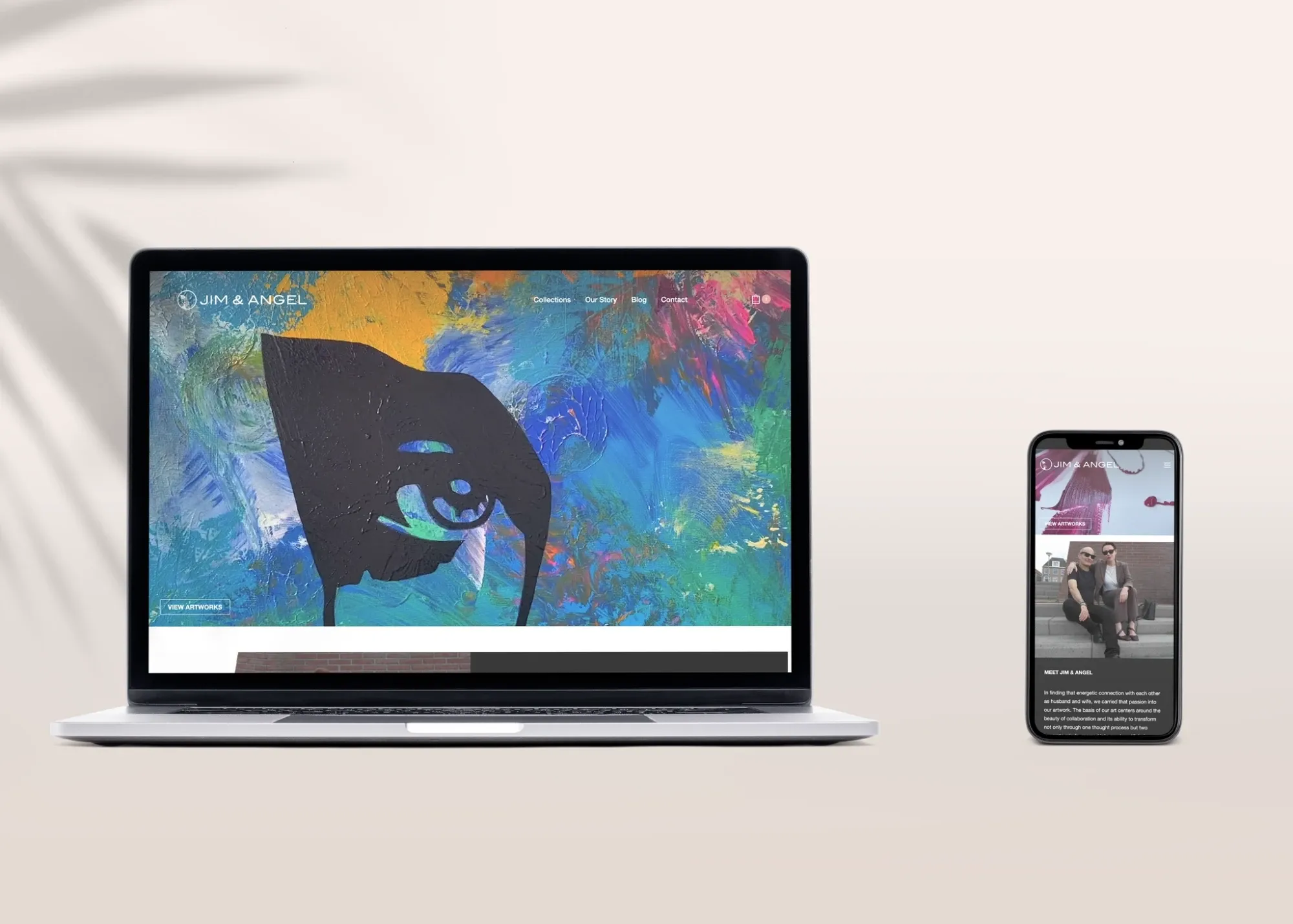
The Problem
Jim & Angel had no digital presence: no website, no way to sell outside of physical exhibitions. Anyone interested in buying their work had to catch them at a gallery show, which limited both reach and sales.
The Goal
Design and build a simple, elegant online gallery and e-commerce experience that makes discovering and purchasing their art intuitive, without letting the interface compete with the artwork itself.
Research
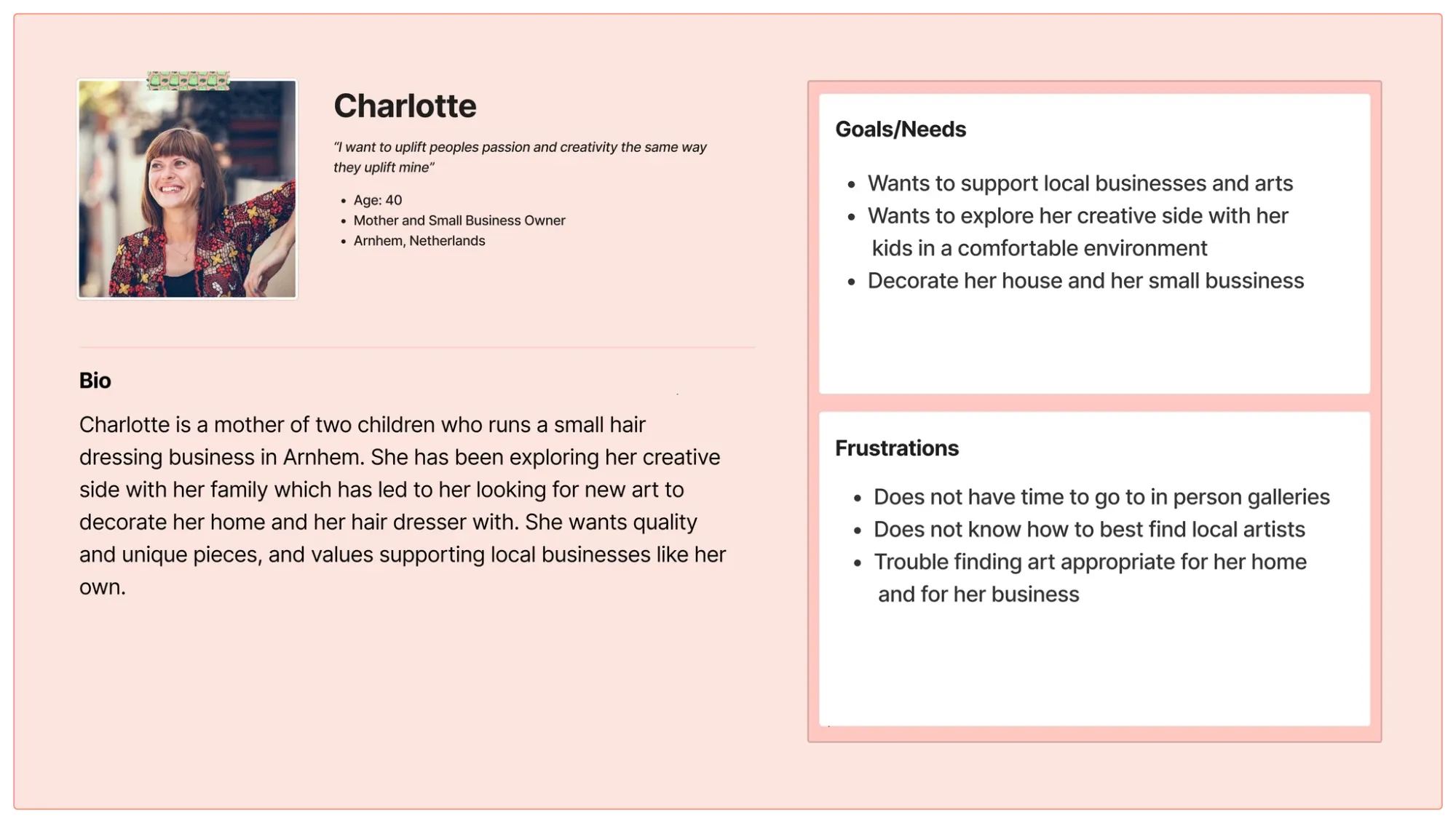
I had informal conversations with Jim & Angel to understand their vision for the site, and reviewed competitor art and e-commerce sites to identify what worked and what didn’t.
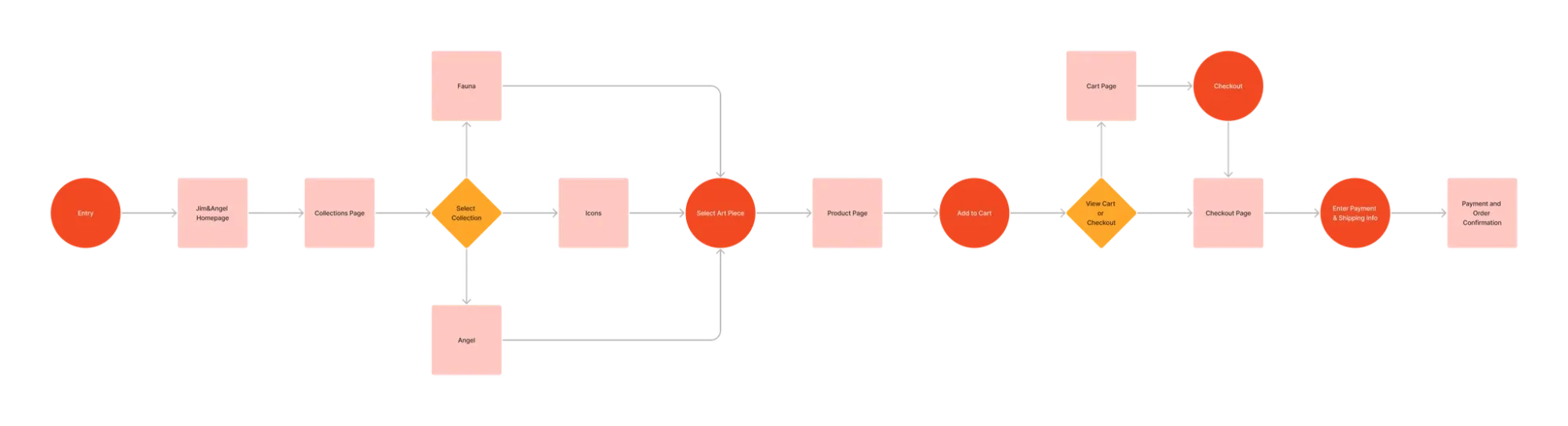
Common issues I found: overly artistic layouts that distracted from the buying flow, checkout processes with too many steps, and product pages missing basic details buyers need to decide (size, materials, price).
Wireframes & Prototyping
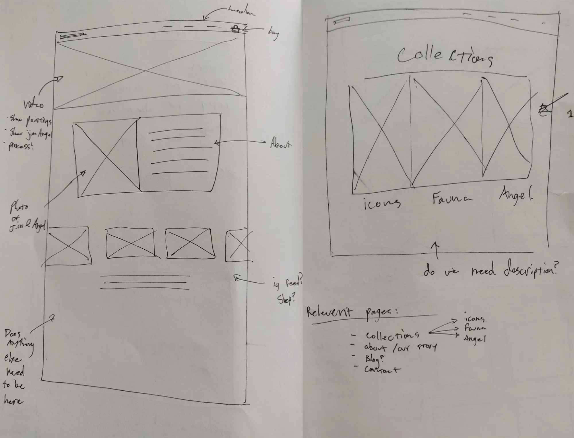
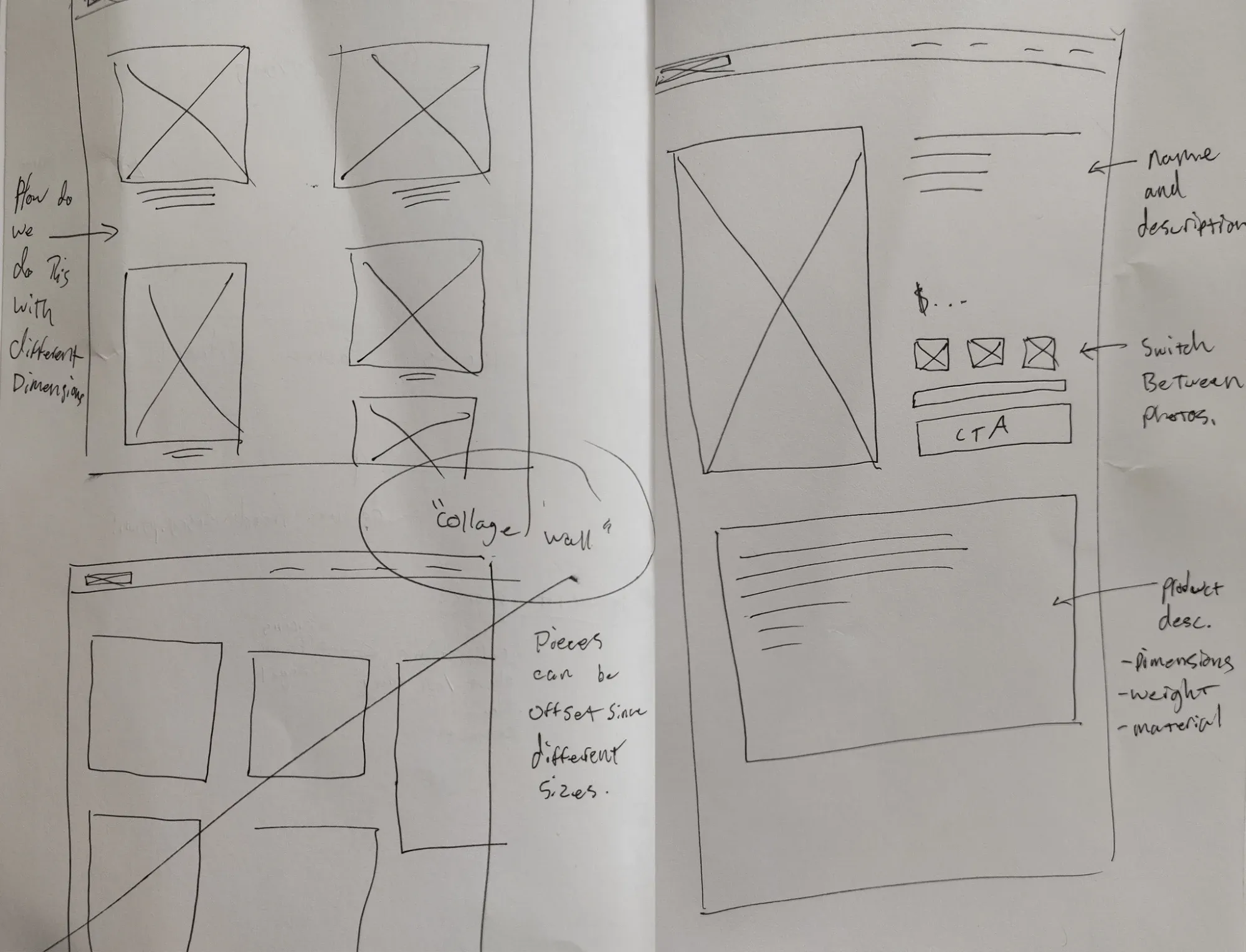
Low-fidelity wireframes let me iterate quickly and get feedback from Jim & Angel before committing to final design. I prioritized a minimal layout that kept the art as the focal point, simple navigation, and clear product details on every listing.
Design & Development
I built the final site in WordPress to keep development fast and maintainable for a two-person team without technical staff. Key decisions: a minimal, elegant aesthetic that puts the art first, a streamlined checkout, and high-quality photography and video to represent each piece accurately online.
Outcome
The project gave Jim & Angel their first online platform and the ability to sell directly to buyers outside of gallery exhibitions, removing a hard limit on how many people could discover and buy their work.
Reflection
This was my third full website project, and it sharpened a few things I now apply consistently:
- Performance matters as much as visuals. WordPress got the site live quickly, but involving a backend developer earlier could have improved media load times.
- Simplicity shouldn’t mean generic. In hindsight, I’d push for a stronger visual identity within the minimal layout, so the brand reads as distinctly Jim & Angel rather than a template.
- Research pays off directly. The competitor analysis and journey mapping translated into concrete decisions rather than staying abstract.