KnightRiders
KnightRiders is a web app that gives DJs, photographers and videographers one place to manage the paperwork around a gig: their rider, their invoice and whether they have been paid. I designed it in Figma, built it with Claude Code, and it is live at knightriders.app.
Visit knightriders.app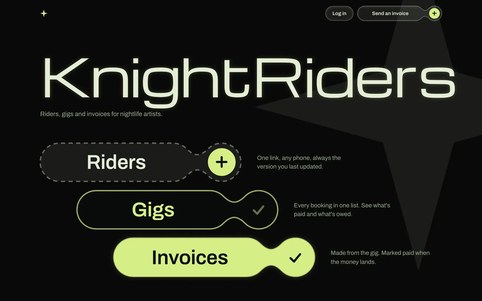
- Role: Product designer, UX designer and builder (solo project)
- Tools: Figma (Variables, components, Figma MCP), Claude Code, Next.js, Tailwind, Supabase, Vercel
- Status: Live. All eight screens are built for mobile and desktop. Testing with real performers is next.
The problem
Performers in nightlife handle their admin in pieces. The artist rider is a jpg, the technical rider is a PDF, and the invoice is a separate email. None of it is connected, and nobody can easily tell what has been sent, what is missing and what is still unpaid.
I host nightlife events myself, so I see this from the organiser’s side, and the DJs in my network work this way too. The design question became: how can a performer keep their rider, invoice and payment status under control without learning a heavy new system?
Research
I started from firsthand experience of the scene and from the performers around me, then used a few clear observations to shape the product.
- Late payment is usually a venue problem, not a tooling problem. So the app tracks payment status and makes it visible. It does not try to enforce anything.
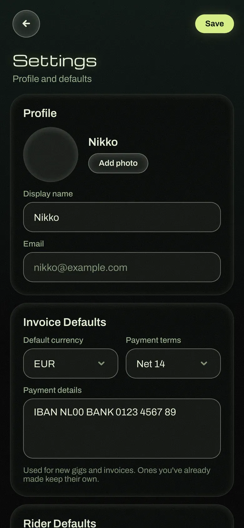
- Performers repeat themselves. The same bio, photo, equipment list and payment details go into every booking. The answer is to build a rider once and reuse it, with defaults for currency, payment terms and rider.
- Not everything happens inside an app. Riders get texted or screenshotted. The app needs a manual way to mark a rider as sent, as a fallback.
Scoping the first version
I kept the first version small on purpose: performers only, with no venue accounts. Before building a two-sided product, I want to learn whether performers actually find the tool useful.
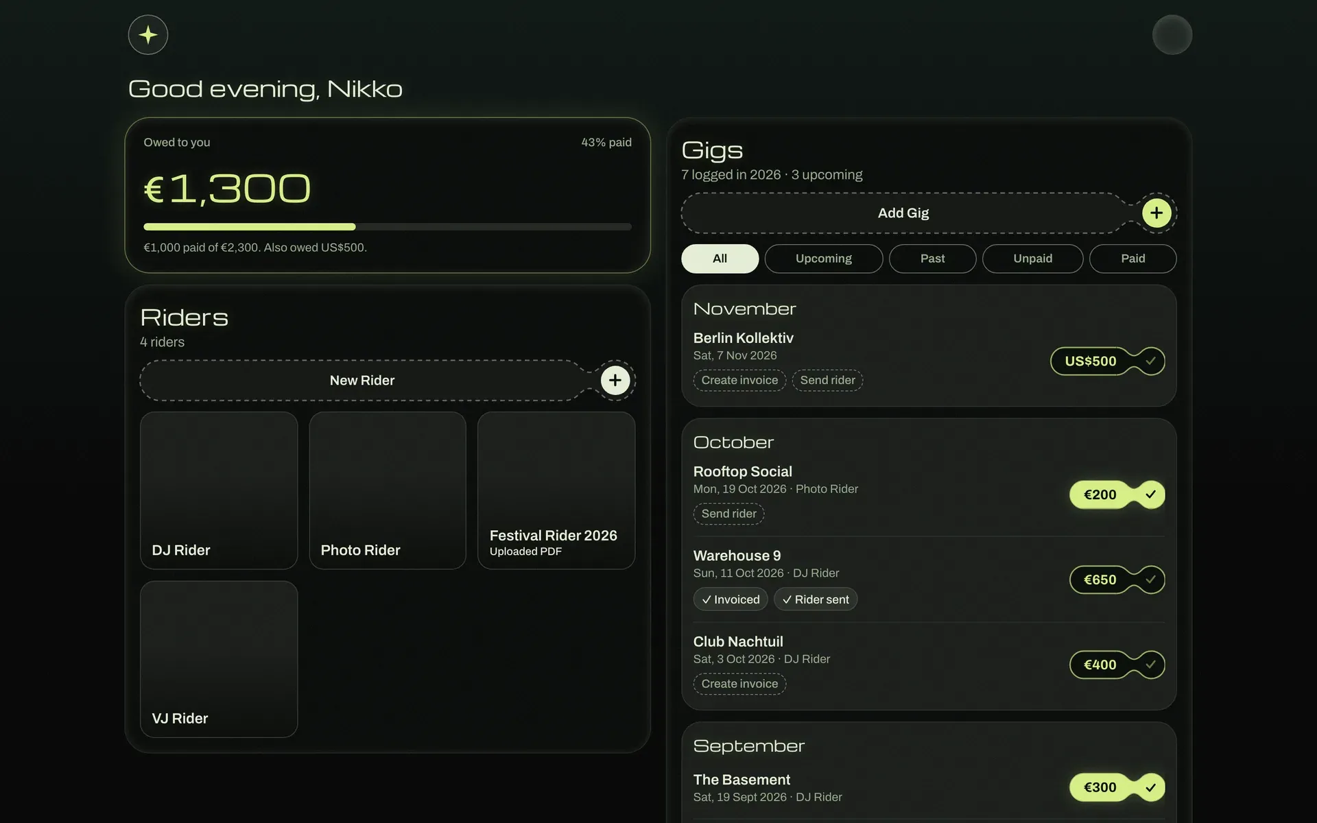
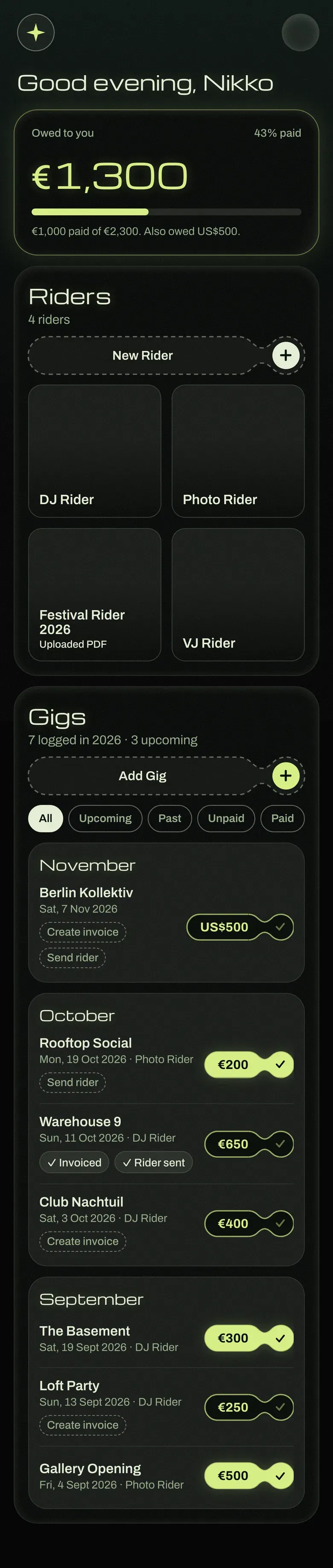
The product rests on three objects. A Rider is the reusable artist and technical info. A Gig is a booking the performer logs. An Invoice is generated for a specific venue and amount. Eight screens cover everything, and with no navigation bar, every screen is reached from the Dashboard.
I wrote down what is out of scope just as carefully: venue-side accounts, real payment processing, e-signatures, automated reminders, and tracking whether a rider link was opened. Each is a reasonable next step. Each would also have made this phase much heavier.
Design
I designed mobile-first in Figma, since performers will mostly use this on their phones, and drew all eight screens in full detail before moving to desktop layouts.
A design system before the screens. I set up Figma Variables for colour, spacing and typography, and built components such as buttons, inputs and cards with variants. This kept screens consistent and gave the build one source of truth for design tokens.
Dark and easy on the eyes. Performers often check the app in a dark club, so the screens stay black and muted, with soft off-white text and nothing bright enough to glare. One green is saved for money and the main action on each screen, so that’s where the eye goes first.
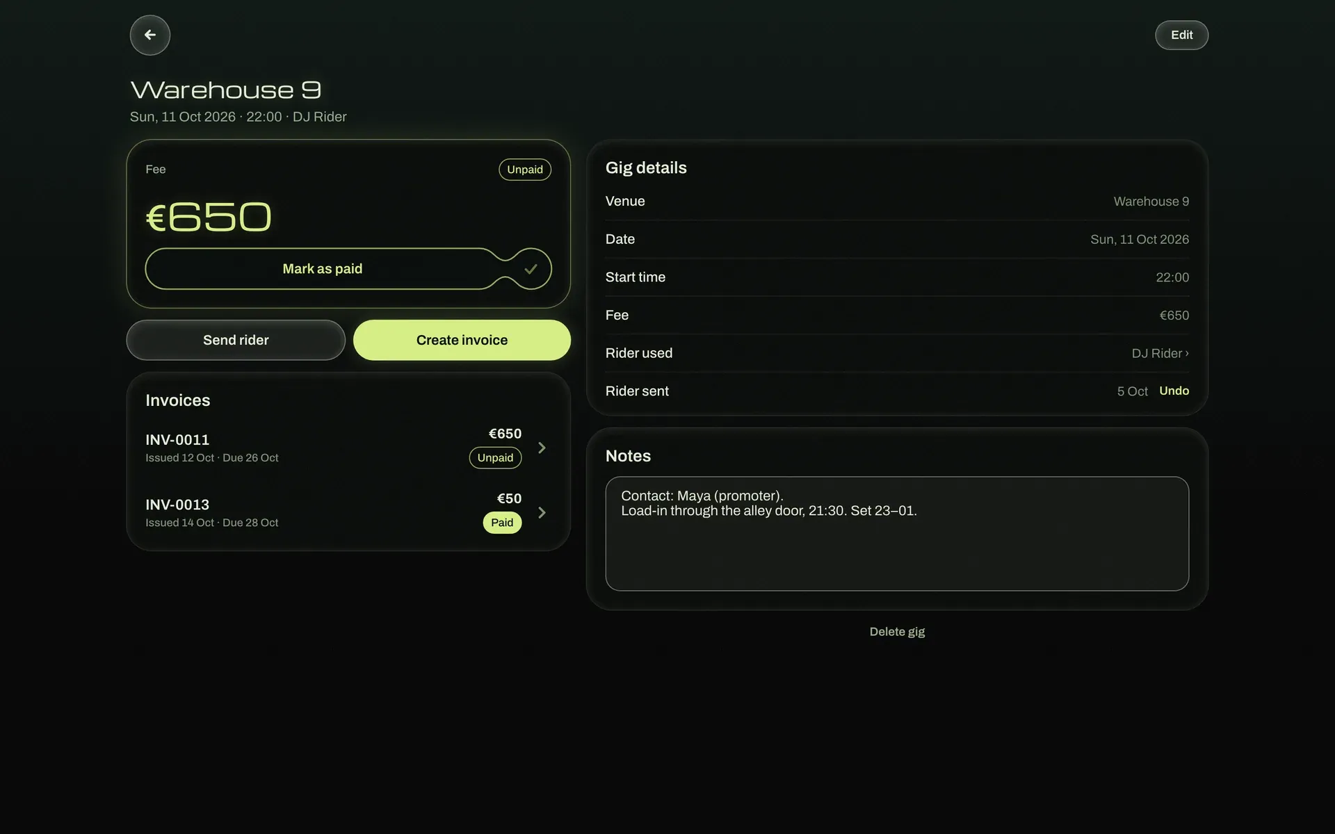
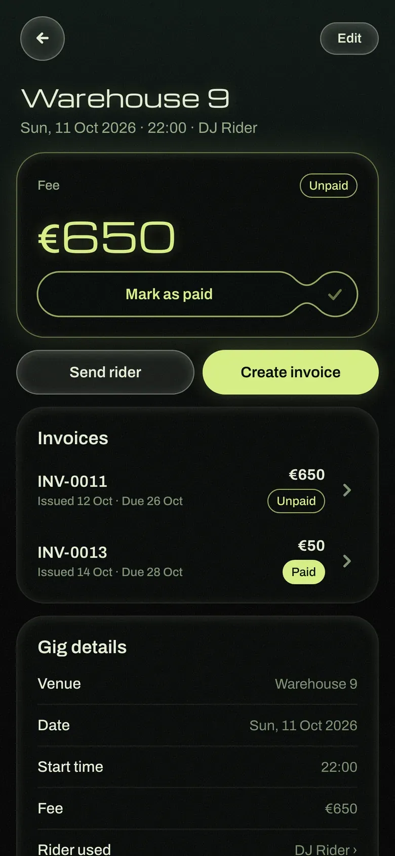
Status that tells the truth. Each gig on the Dashboard shows two independent statuses, one for the invoice and one for the rider. The rider status only changes when the performer actually sends it, not when they open the preview and back out. A manual override handles riders shared outside the app.
Build once, reuse. A rider is filled in once and becomes both a PDF and a shareable link, so the same link always shows the latest version.
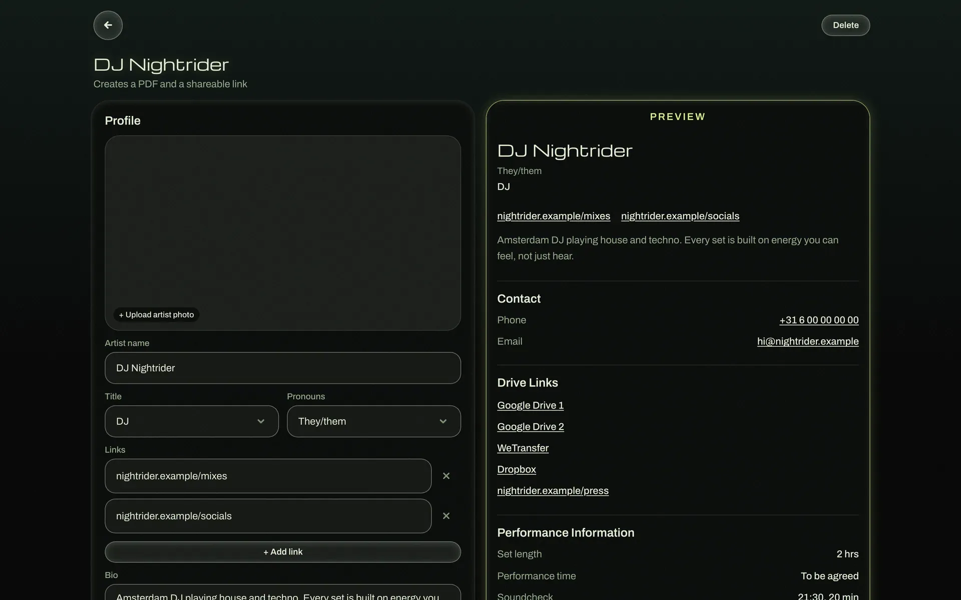
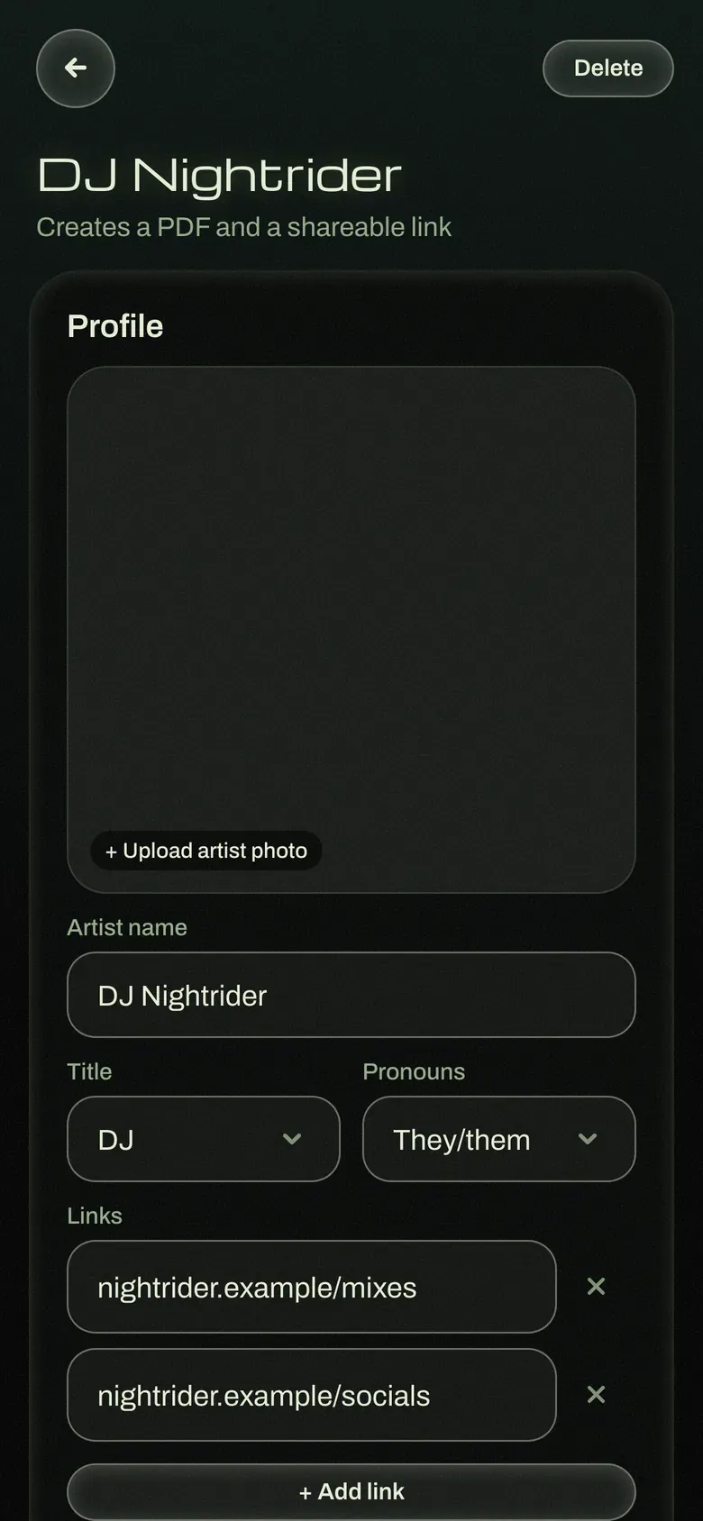

Details that protect the user. Each gig and invoice stores the currency it was created with, so changing the default currency later never rewrites past records.
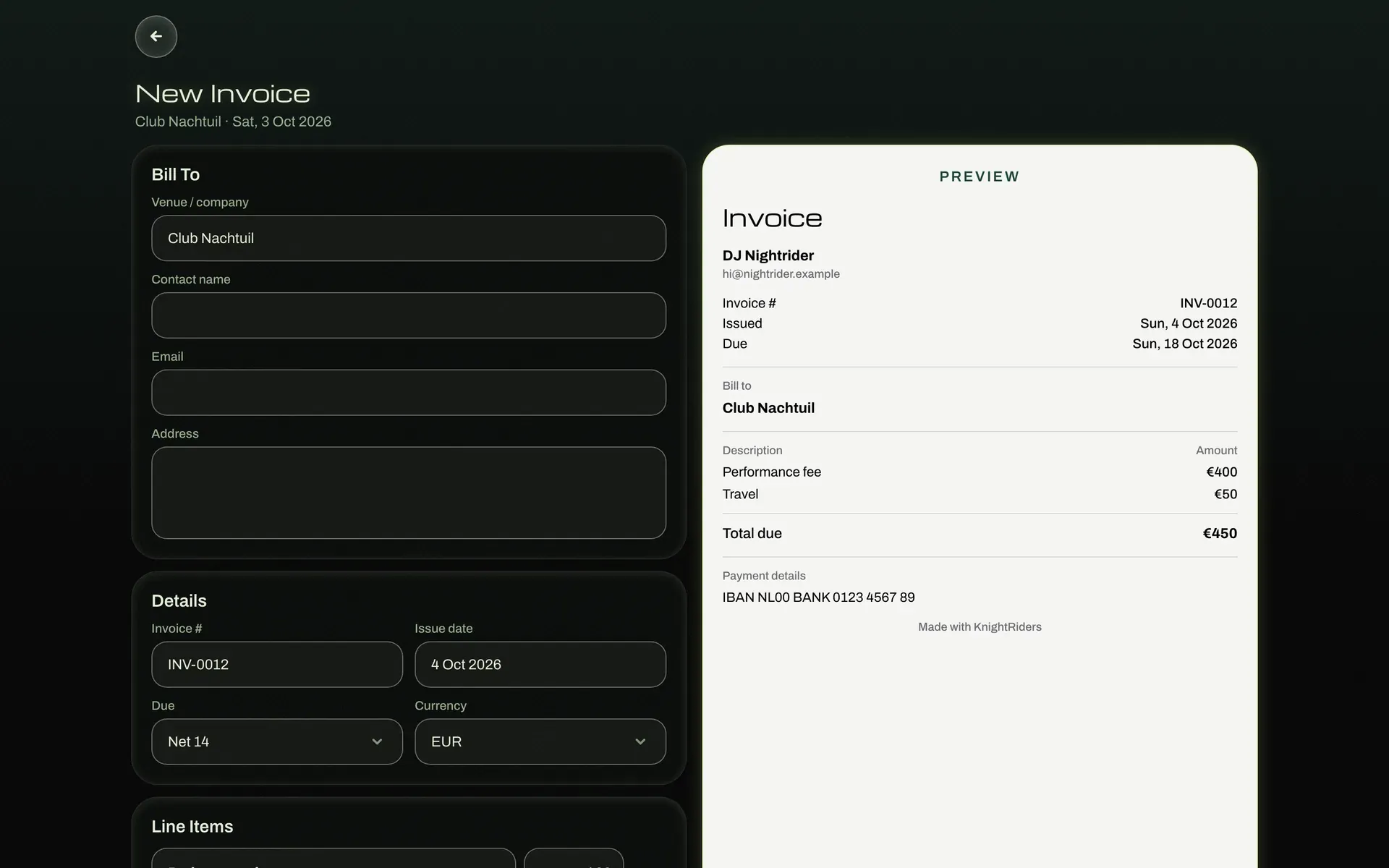
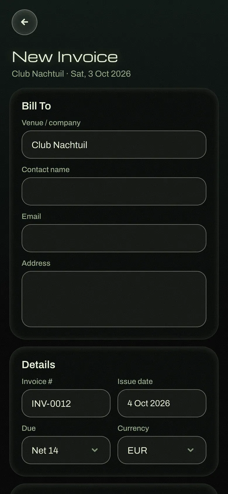
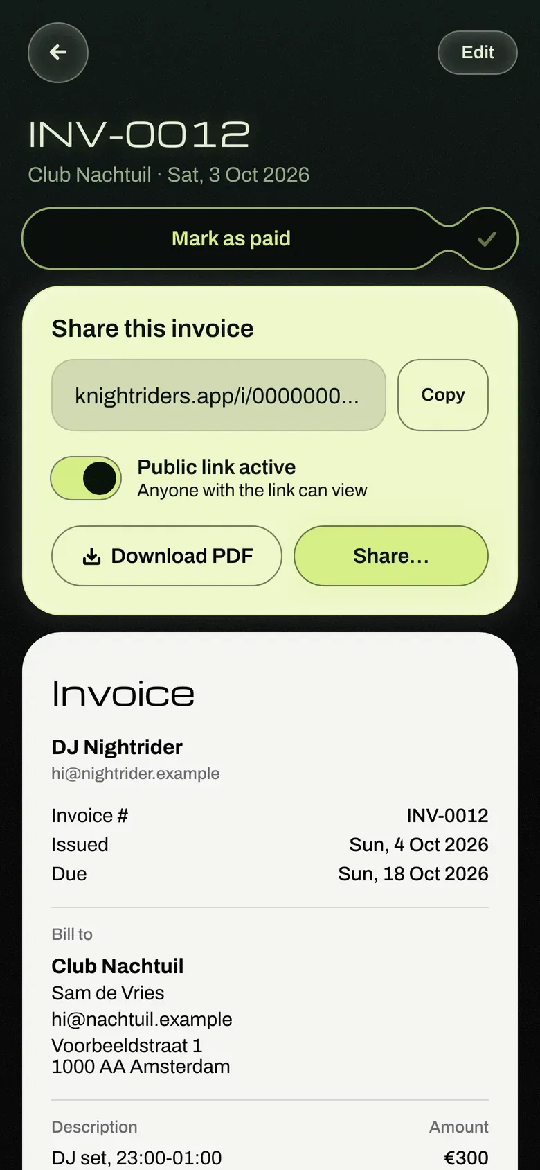
Motion with purpose. Screens slide forward and back, pop-ups grow in, and the fee and Mark as paid capsules fill with green. All of it respects the Reduce motion setting.
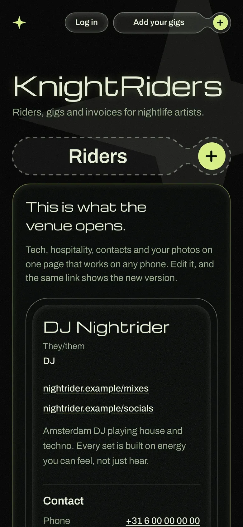
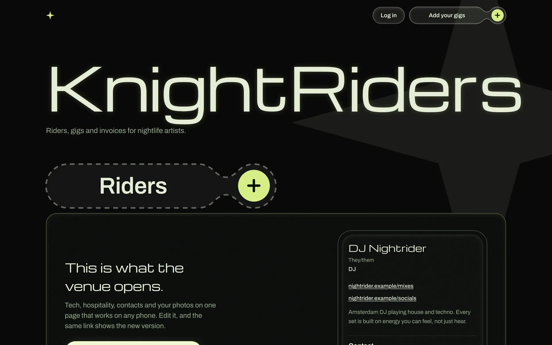
I also designed a public homepage, with a flyer-style layout and real previews built on fictional sample data.
Building with Claude Code
I am a designer, not a developer, so the build relied on a clear spec and a tight link to the design file.
- A PRD as the source of truth. I wrote a product requirements document covering the data model, screens, terminology, tech stack and what is out of scope. Every Claude Code session starts by reading it.
- Figma to code through the Figma MCP. I pointed Claude Code at specific Figma frames instead of screenshots, so it read the real layout and styles.
- Design tokens, not hardcoded values. The Figma Variables became the Tailwind configuration, and shared components reference those tokens. Colours and spacing are never set directly inside a screen.
- Small pieces, not whole pages. I built section by section and component by component, which produced cleaner code.
- Guardrails against drift. The PRD tells Claude Code to stop and check in if it starts building something out of scope, even if it seems like a natural next step.
The stack is Next.js and Tailwind on Vercel, with Supabase for the database, sign-in and file storage, and server-side PDF generation for riders and invoices.
Testing and hardening
Because the app holds performers’ personal and payment details, I treated trust as part of the experience.
- Design audit. I checked every screen for accessibility and polish, including field outlines, loading screens and consistent date formats.
- Two security audits. These led to security headers, safe redirects, CAPTCHA on sign-in and a stricter content security policy.
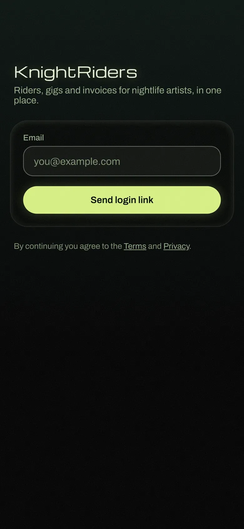
- Simple, safe sign-in. Performers can use email codes or links, or continue with Google, which is set up with verified branding.
- User control. Settings include data export and account deletion, and the Terms and Privacy pages match what the app actually does.
Reflection and next steps
What is next: I will test KnightRiders with a few DJs from my network. Their feedback decides what comes next, whether that is refining the performer tools, a venue side, or an eventual native app.
What I learned
- Status should reflect what a person did, not where they navigated. This small rule made the Dashboard far more trustworthy.
- Setting the scope in writing made it easier to say no to good ideas that did not belong in this phase.
- A design system built before the screens made the move from Figma to code much cleaner.